Music
Superstars from the '90s to now. The songs that were the soundtrack the first time round, and the ones that are the soundtrack now.

Brand Guidelines · 2026
Dubai & Abu DhabiGrown-up money, teenage energy. The station for the 30-plus crowd in Dubai who never quite got round to growing up — and have no plans to start.
01 — The brand idea
We are the sound of a city that works hard, plays harder and refuses to act its age.
Dubai 92 is premium without being polished into silence, warm without being soft, and edgy without trying too hard. It is the friend who books the flight, gets the table, knows the promoter — and still queues for the waterslide.
Everything we make should feel bright, quick and confident. Green ground, black type, one coral action. If it feels corporate, it is wrong. If it feels juvenile, it is also wrong.
02 — Who we are talking to
03 — Brand pillars
Superstars from the '90s to now. The songs that were the soundtrack the first time round, and the ones that are the soundtrack now.
Concerts, festivals, stand-up and the big nights out. We show up, we host, we partner with the events that matter.
Weekends, brunches, waterparks, dune days. Grown-up plans with the kids in tow — and nobody pretending to be sensible.
Dubai is home. Abu Dhabi is family. The cities are in the brand — the light, the skyline, the sand, the pace.
04 — The logo
05 — Colour, screen and press
The brand. Headers, gradients, station tiles, hero grounds. Green is the first thing anyone sees.
Nearest: Pantone 354 C
The other end of every gradient. Player bars, deep panels, footers.
Nearest: Pantone 3295 C
Navigation bar, pill labels, all body type on light. Never used as a full-page ground.
Nearest: Pantone Black 6 C
One job only: play buttons, live badges and the single action you want pressed.
Nearest: Pantone 1785 C
Quiet section grounds so white pages still feel like the brand.
Print as a 6% tint of 354 C
The page. Content sits on white, colour is used in blocks around it.
Unprinted stock
CMYK values are coated-stock builds. Signal Green is far brighter on screen than in process print — specify Pantone 354 C as a spot colour for wraps, posters and large-format work, and only fall back to the 80/0/78/0 build when a spot plate is not available. Ink Black prints as a rich black; never 100% K alone on large areas.
Set type in Ink Black on green, mint and white — black on Signal Green clears AA comfortably. White type is only for teal, black and the darker half of the gradient. Coral is never used for type: it is a button, a badge and nothing else.
06 — Gradient & pattern
100° · Signal Green 0% → Deep Teal 100%
Bright green on the left, teal settling to the right. Logo and headline on the green half.
One gradient per composition, then let white cards carry the content.
No radial blends, no third colour, no long paragraphs set over the gradient.
The waveform device: bars anchored to one edge, aligned to the grid, always leading the eye toward the logo or the play button.
07 — Typography
Display · Poppins ExtraBold Italic
Feel great
One face, one voice. Geometric, heavy, italic and set in sentence case — never all caps, never letterspaced open. The forward lean is the brand's energy.
Body · Poppins Regular
The same family upright does the calm half of the job, with generous leading and plenty of white around it.
Regular for paragraphs at 1.65 line height, SemiBold for standfirsts, Bold Italic inside black pills for labels, badges and station names.
| Style | Face | Size | Tracking | Use |
|---|---|---|---|---|
| Display XL | Poppins ExtraBold Italic | 56–120px | -2% | Billboards, hero shouts, event artwork |
| Display | Poppins ExtraBold Italic | 32–48px | -2% | Section headlines, show titles |
| Pill label | Poppins Bold Italic | 14–16px | 0 | Black pill badges: station names, Nu Live, slots |
| Subhead | Poppins SemiBold | 18–22px | 0 | Standfirsts, show taglines |
| Body | Poppins Regular | 16–17px / 1.65 | 0 | Paragraphs, schedules, captions |
| Nav / meta | Poppins Medium | 14–15px | 0 | Navigation, metadata, legals |
The numerals are brand furniture. Set “92” in display italic, optically aligned, and use it alone as a stamp on merchandise, socials and event signage — never re-drawn from the logo artwork.
08 — Tone of voice
09 — The brand in the world
SearchLog inThe Big Wake Up
Sami & Cal · 06:00 – 10:00
Now playing
Groove Is In The Heart
Deee-Lite
Listen also to
Dubai 9290s HitsNonstopPartyChilledArabiaThe Big Wake Up
Lunch on 92
Drive Home Live
Groove Is In The Heart · Deee-Lite
Green header, black nav, gradient player, then white cards and green station tiles with black pill labels. One coral play button is the only thing shouting.
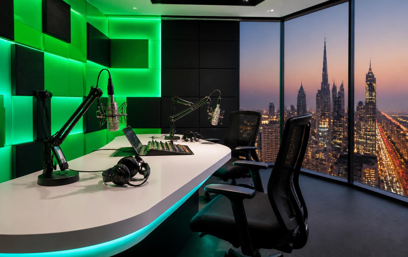
Signal Green light wall behind the presenters, black acoustic panelling and desk, white surfaces for the camera. The waveform device runs along the desk front.
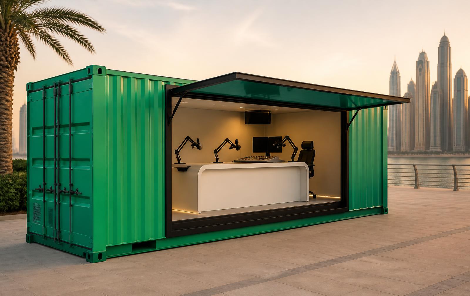
A 20ft container as a roadshow studio: full green-to-teal gradient wrap, white mark on the green end, black pill signage over the hatch.
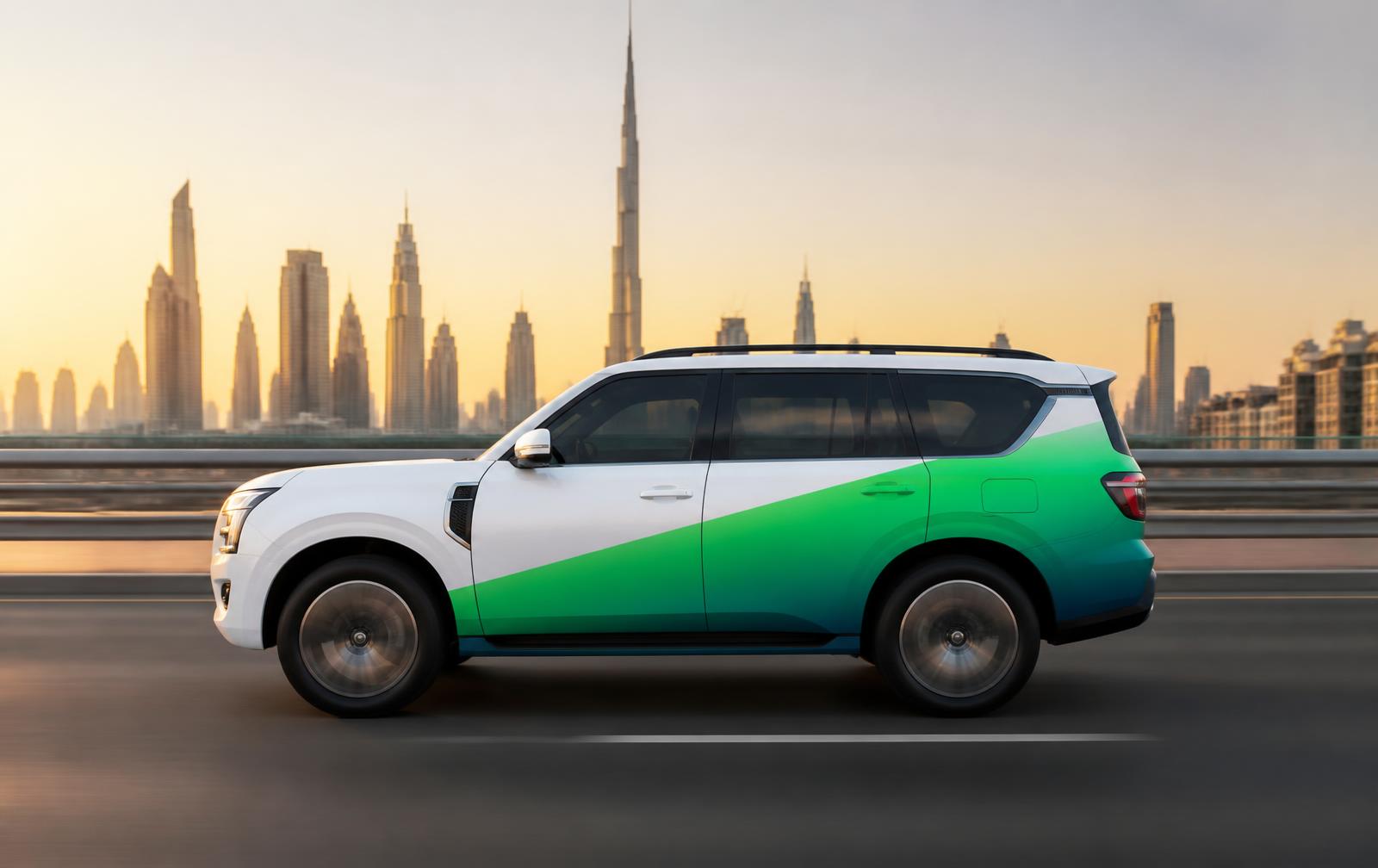
Gloss white body, gradient sweep across the doors, mark on the front wing and tailgate at a minimum 250mm width so it reads at 100km/h.
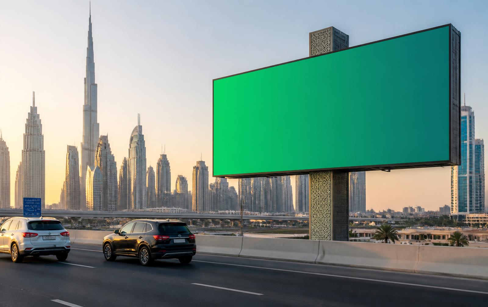
Listen to Dubai 92 and feel great.
One line, one mark, nothing else. Copy set in display italic in Ink Black on the green half, mark reversed out in white. Legible in two seconds at 100km/h.
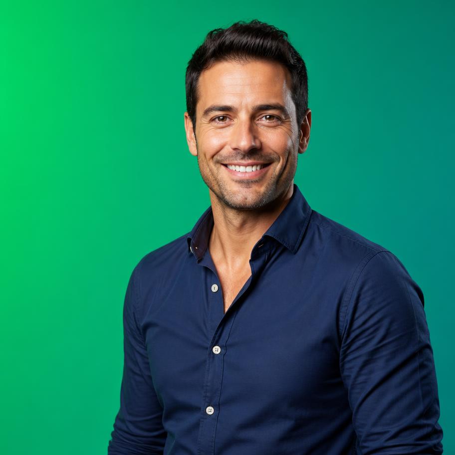
The Big Wake Up
with Sami & Cal
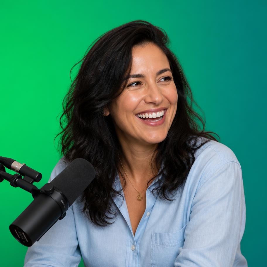
Drive Home Live
with Rana Haddad
Square format. Presenter cut out on a green gradient, black scrim from the bottom, slot in a coral pill, show title in display italic, mark top-right at a fixed 12% of the frame width.
10 — Designer cheat sheet
Signal Green
#00CE63
CMYK 80 / 0 / 78 / 0
Deep Teal
#0B7F72
CMYK 85 / 30 / 58 / 12
Ink Black
#101010
CMYK 65 / 55 / 50 / 95
Coral Play
#FF5C6C
CMYK 0 / 75 / 45 / 0
Mint Tint
#ECFBF1
CMYK 6 / 0 / 6 / 0
Pure White
#FFFFFF
CMYK 0 / 0 / 0 / 0